Picturesque
Picturesque is an image-forward layout where visual hierarchy leads with photography. The design dedicates more screen real estate to images than to text, using large hero blocks, full-width galleries, and tight supporting text that captions and contextualises rather than dominates. This is a layout for sites where images carry the primary narrative — photography portfolios, travel journals, food blogs, architectural showcases, and product-focused editorial.
The fundamental challenge with image-heavy layouts is preventing them from feeling like a slideshow. Picturesque solves this by integrating text blocks into the image rhythm rather than alternating between image and text sections. Each image group has an associated text block that sits within or adjacent to the images, creating a unified composition rather than a stack of separate elements. The effect is closer to a well-designed print magazine spread than a typical web gallery.
Photographers and visual artists evaluating layout options, theme authors building portfolio themes, and site owners who need their images to feel curated rather than uploaded will find the structural patterns here directly applicable. The notes below cover aspect ratio management, lazy loading strategies for image-heavy pages, and the CSS techniques that make text-over-image compositions accessible.
Layout Anatomy
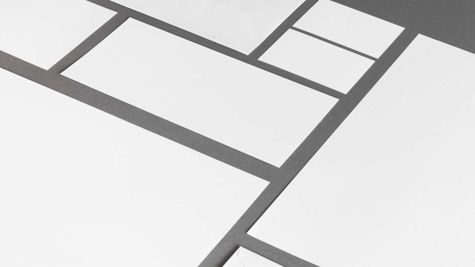
Picturesque uses a fluid grid that alternates between full-width image blocks and a constrained text column of 55 characters. The narrower text measure is intentional — it creates a strong contrast between the expansive image areas and the compact reading zones, preventing text from feeling lost on the page. Image blocks use aspect-ratio containers to prevent layout shift, with common ratios of 16:9 for heroes, 4:3 for supporting images, and 1:1 for detail shots.
Spacing and Typography Notes
Spacing between image blocks is minimal — 4px gaps create a magazine-style contact sheet effect when images are grouped. Spacing between an image group and its associated text block is also tight (16px) to reinforce the connection between visual and verbal content. The generous spacing lives between image-text groups (4× standard), creating clear visual chapters as the reader scrolls.

Body text is set at 15px — slightly smaller than the standard 16px — because the images set the visual scale and larger text would compete with them for attention. Headings use a condensed style to minimise their footprint, allowing images to remain the dominant element. Image captions use a monospaced font at 12px, positioned below-right, which gives them a utilitarian quality that contrasts with the visual richness above.
Components in This Layout
Core components include the hero image block (full-viewport-width), the image pair (two images side by side with independent aspect ratios), the image trio (three images in a 2:1:1 ratio grid), the captioned text block, and the gallery strip (horizontal scroll of thumbnail images). The image trio is the most versatile — it handles landscape, portrait, and square images in a single composition. The gallery strip uses scroll-snap for a controlled horizontal browsing experience.
Common Implementation Mistakes
- Not using aspect-ratio containers. Without them, images cause significant layout shift as they load, which is especially jarring in an image-heavy layout where every shift compounds.
- Loading all images eagerly. Picturesque pages can easily have 15-20 images. Use loading='lazy' on everything below the fold and consider intersection observer for gallery strips.
- Placing text over images without a scrim or contrast-safe zone. Accessibility requires a 4.5:1 contrast ratio for body text — a semi-transparent gradient overlay or dedicated text area within the image composition is necessary.
- Using uniform aspect ratios for all images. The visual variety in Picturesque comes from mixing 16:9, 4:3, and 1:1 ratios. All-16:9 creates a monotonous slideshow feel; mixing ratios creates a curated editorial look.
- Forgetting to test with portrait-orientation images on mobile. An image that works beautifully as a 4:3 landscape on desktop may push below-the-fold content unreasonably far down on narrow viewports.