Retro Fitted
Retro Fitted borrows from broadsheet newspaper layouts and adapts them for screens. The structured columns, ruled dividers, and justified text blocks create a look that feels editorial in the traditional sense — closer to a Sunday supplement than a web page. This is a layout for sites that want to project authority, permanence, and the kind of institutional confidence that comes from looking like you have been publishing for decades.
The challenge with newspaper-inspired web layouts is that print conventions do not always translate directly. Justified text creates uneven word spacing on narrow columns unless hyphenation is handled properly. Multi-column grids need careful breakpoint management to avoid columns that are too narrow to read. Ruled dividers that look sharp in print can feel heavy on screens. Retro Fitted addresses each of these issues with specific techniques we developed through several iterations.
News publishers, institutional sites, editorial magazines, and cultural organisations will find the most value in this layout. It is also useful as a study in how to modernise print-era design conventions without losing their visual authority. The notes below cover the grid logic, divider system, and the specific CSS properties that make justified text work on the web.
Layout Anatomy
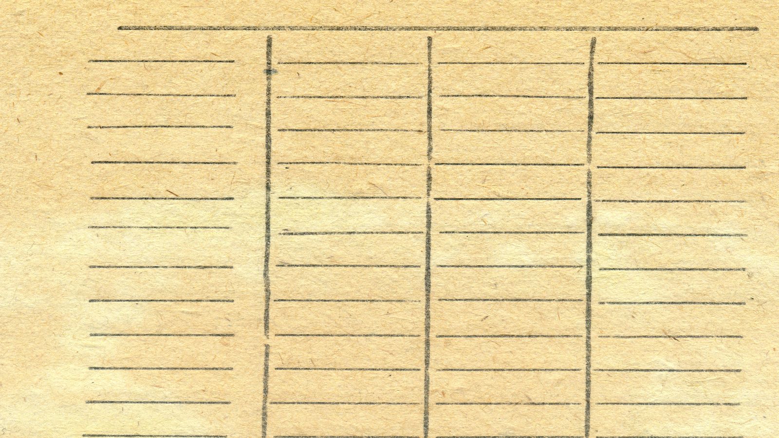
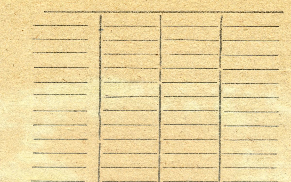
Retro Fitted uses a three-column grid at wide viewports (1100px+), collapsing to two columns at medium (768px) and single column on mobile. Column widths are equal, separated by a combination of gap spacing and visible ruled lines. The grid uses CSS Grid rather than flexbox because grid allows precise alignment of content across columns — a critical requirement for the newspaper aesthetic where horizontal baselines should roughly align across adjacent columns.
Spacing and Typography Notes
Spacing follows newspaper conventions: tight line height (1.45) within columns, generous vertical spacing between articles (3× the line height). The ruled dividers are 1px solid lines at 20% opacity — visible enough to define column boundaries without creating the 'caged' feeling that heavier dividers produce. Horizontal section rules between article groups use a slightly heavier 2px line with small decorative terminators, a detail borrowed from broadsheet mastheads.
Retro Fitted is one of the few layouts where justified text is intentional and works well. The key is CSS hyphens: auto combined with a minimum word count per line to prevent rivers of whitespace. The serif heading font is set at a heavier weight than most editorial layouts — 800 — to match the visual density of newspaper headlines. Drop caps on leading articles use the ::first-letter pseudo-element with a float, sized to span three lines of body text.
Components in This Layout
Key components include the article card (a discrete content block within the grid), the ruled column divider, the masthead section header, the drop cap, and the byline block. Article cards have no visible background or border — their boundaries are defined entirely by surrounding whitespace and divider rules. The masthead header uses small caps and wide letter spacing, set in the heading serif at a smaller size than you might expect, which creates the institutional feel without dominating the page.
Common Implementation Mistakes
- Using justified text without enabling CSS hyphens. Rivers of whitespace appear immediately, especially in narrow columns. The hyphens: auto property is essential, and you should test with a language attribute set on the html element.
- Making the three-column layout the only layout at wide viewports. Some articles need the full width — feature pieces and lead stories should span two or three columns. Without this flexibility, every article looks like a brief.
- Setting ruled dividers at full opacity. Print dividers work at high contrast because ink on paper has different visual properties than pixels on a screen. Anything above 30% opacity feels heavy on most displays.
- Forgetting that CSS Grid column alignment depends on content height. Newspaper layouts rely on content being trimmed to fit the available space. On the web, variable content lengths mean you need to either set a max-height with overflow, or accept that columns will not align horizontally.
- Using the broadsheet aesthetic for casual or playful content. The layout projects seriousness and institutional weight. If the content tone does not match — product reviews, lifestyle blogs, personal journals — the design creates a dissonance that undermines credibility rather than enhancing it.