
Socially Awkward
Socially Awkward is an unconventional layout that breaks grid expectations deliberately. Off-axis placements, unexpected whitespace, and intentional misalignment create a composition that feels more like a designer's sketchbook than a polished publication. The name is honest about what it does — this layout makes visitors slightly uncomfortable in a way that makes them pay more attention. It is confrontational design with a purpose.
We built Socially Awkward as an experiment in controlled chaos. The question was whether a layout that violates common alignment principles could still be readable and navigable if the underlying structure remained sound. The answer is yes — but only if the 'awkwardness' is systematic rather than random. Every off-axis element in this layout sits on a secondary grid that is rotated 2 degrees from the primary. This creates visual tension without actual disorientation.
Creative agencies, experimental design studios, art publications, and anyone building a site where standing out matters more than blending in will find this layout worth studying. It is also a useful exercise for theme authors who want to understand where conventional grid rules can bend without breaking — the principles behind Socially Awkward inform better design decisions even in traditional layouts.
Layout Anatomy
Socially Awkward uses a 12-column base grid — the same foundation as most conventional layouts — but places elements at non-standard column spans and offsets. A headline might span columns 2-10 instead of 1-12. An image block might start at column 4 and end at column 11. The resulting asymmetry is what creates the 'awkward' feeling, but because every element still snaps to the underlying 12-column structure, the layout remains fundamentally ordered. A secondary grid rotated 2 degrees provides positioning for accent elements.
Spacing and Typography Notes
Spacing in Socially Awkward is deliberately uneven. Instead of consistent vertical rhythm, sections alternate between tight spacing (1× line height) and generous spacing (4× line height). This creates a staccato reading pace that matches the visual irregularity. The uneven spacing forces readers to actively engage with the page rather than falling into the passive scanning mode that consistent rhythm enables. It is uncomfortable by design — but the discomfort serves the content.
Typography mixes two contrasting approaches. Headings use an oversized serif at irregular sizes — H1 might be 48px on one section and 36px on the next — creating a handmade quality that reinforces the sketchbook aesthetic. Body text remains consistent at 16px with standard line height, providing a stable reading experience that anchors the visual chaos above it. The contrast between chaotic headings and steady body text is what makes the layout readable despite its unconventional appearance.
Components in This Layout
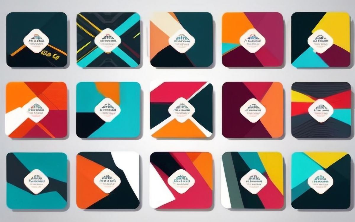
Components include the off-axis card (rotated 1-3 degrees with a slight shadow), the overlapping image block (where two images partially overlap, with z-index controlling which appears in front), the margin note (text placed in the wide gutter areas), and the rule-breaking divider (a diagonal line instead of horizontal). The overlapping image block is the signature component — it creates depth and visual interest that flat, non-overlapping layouts cannot achieve.

Common Implementation Mistakes
- Making the rotation angles too large. Beyond 3 degrees, off-axis elements stop looking intentional and start looking broken. The sweet spot is 1-2 degrees for most elements, with 3 degrees reserved for small accent pieces.
- Breaking the base grid. The entire layout depends on elements still aligning to the 12-column structure underneath. Random placement — truly random, not grid-offset — creates actual chaos rather than controlled awkwardness.
- Applying the uneven spacing to body text paragraphs. The staccato rhythm works for section-level spacing. Within a section, body text needs consistent paragraph spacing to remain readable.
- Using Socially Awkward for content that needs scanning. Job listings, product catalogues, event schedules — anything where users need to quickly locate specific information — will frustrate visitors in this layout. The intentional discomfort works only for content that rewards focused reading.
- Forgetting to test with screen readers. Off-axis visual placement must not affect DOM order. Elements should read in logical order regardless of their visual position — use CSS transforms for rotation rather than absolute positioning that changes source order.