
Trending
Trending is a magazine-style layout built around modular content blocks. The grid is designed to handle multiple content types on the same page — feature articles, compact listings, image galleries, and quick-read cards — without any single element feeling out of place. This is the layout you reach for when a page needs to serve as both a destination and a navigation hub, guiding readers toward deeper content while delivering enough surface-level value that casual visitors do not leave empty-handed.
We developed Trending for sites that publish frequently and need a front page or section index that stays fresh without constant manual curation. The modular block system means content managers can rearrange the page by reordering components rather than redesigning the layout. A feature story can swap positions with a gallery block, or a compact listing can expand into a full-width feature, without breaking the visual coherence of the page.
Online magazines, news-oriented sites, community platforms, and content-rich organisations will find this layout directly useful. It is also a strong reference for theme authors building customisable homepage layouts where end users need to rearrange sections without touching code. The notes below cover the modular grid system, responsive collapse behaviour, and the component library that makes Trending flexible.
Layout Anatomy
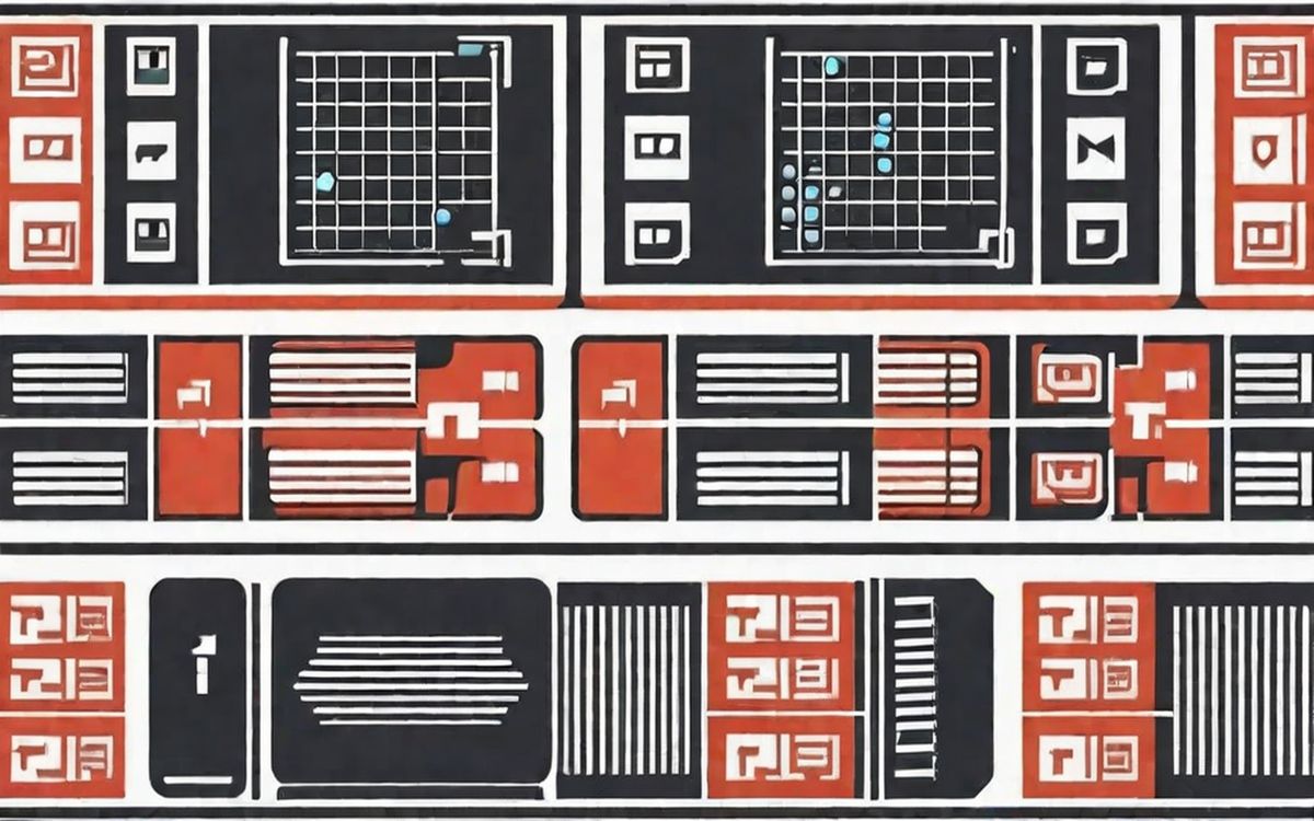
Trending uses a flexible grid built on CSS Grid with named template areas. The default configuration shows a 3-column layout with the feature story spanning two columns and the sidebar taking one. Below the feature, a 4-column compact grid displays shorter content. The grid adapts through named area reassignment rather than breakpoint-specific column definitions, which means the layout can be reconfigured by changing a few grid-template-areas values rather than rewriting the column logic.
Spacing and Typography Notes
Inter-block spacing is consistent at 20px — tight enough to feel magazine-like, generous enough to prevent adjacent blocks from merging visually. Internal block spacing varies by component type: feature blocks have more internal padding (24px) while compact cards use tighter spacing (12px). This variance in internal spacing is what creates the visual hierarchy between different content types sharing the same grid.
Feature headlines use a 28px serif at 700 weight, compact card headlines use an 18px sans at 600 weight, and listing items use a 14px sans at regular weight. The three-tier type system matches the three-tier content hierarchy: if readers see a large serif headline, they know it is a feature. Smaller sans headlines signal compact content. The type treatment alone communicates content priority before the reader processes the words themselves.
Components in This Layout
The component library includes the feature block (2-column span, large image, full headline and excerpt), the compact card (single column, thumbnail, headline, and short description), the listing strip (horizontal row of 4-6 minimal items), the gallery block (image grid with overlay text), and the stat block (a single number or metric with supporting context). These components can be mixed freely within the grid — the consistent spacing and type hierarchy maintain coherence regardless of arrangement.
Common Implementation Mistakes
- Using the same component type everywhere. The visual hierarchy depends on mixing feature blocks with compact cards and listings. An all-feature-block page loses the magazine quality and feels like a blog roll.
- Allowing the 4-column compact grid to display at narrow widths. Below 600px, 4 columns create cards too narrow to read. The collapse to 2 columns needs to happen earlier than you might expect.
- Neglecting the image aspect ratio consistency within each component type. Feature blocks should use 16:9, compact cards should use 4:3, and listings can omit images entirely. Mixing ratios within a component type creates visual disorder.
- Over-filling the page. Trending works best with 8-12 visible blocks above the fold. Beyond that, the modular variety starts to feel overwhelming. Use pagination or 'load more' rather than extending the grid indefinitely.
- Forgetting that named template areas need to be re-declared at each major breakpoint. The areas that work at 1200px may produce unexpected overlaps or gaps at 768px if not explicitly redefined.