
Unique
Unique is an experimental layout where no two sections share the same visual treatment. Each content block has its own grid, spacing, and component arrangement, creating a page that unfolds as a series of distinct compositions rather than a repeated template. The name is literal — this layout is designed for sites that refuse to look like anything else, where the willingness to invest in custom section design is itself a statement.
Building a non-repeating layout that still feels coherent is a genuine design challenge. Without visual repetition, the elements that normally create unity — consistent column widths, predictable spacing, recurring component patterns — are unavailable. Unique solves this with two unifying strategies: a shared colour palette that threads through every section, and a consistent typographic scale that provides a baseline of familiarity even as the layout shifts around it.
Creative directors building campaign landing pages, studios presenting case studies, and designers who need a layout that makes people stop and look will find Unique's approach worth studying. It is also an honest test of how far you can push structural variety before a page stops feeling like a single coherent document. The answer, as the notes below detail, depends on what you hold constant while everything else changes.
Layout Anatomy
Each section in Unique uses a different grid configuration: the first section might be a 3-column asymmetric grid, the second a full-width single column, the third a masonry-like staggered layout, and the fourth a centered narrow column. The only grid constant is the 16px base gutter and the same 12-column underlying structure. This means sections can be rearranged without causing alignment conflicts — the individual grids are different, but they all derive from the same base, which prevents misalignment at the pixel level.
Spacing and Typography Notes
Section-to-section spacing is uniform at 80px, which provides the visual breathing room needed when the layout itself changes between sections. Internal spacing within sections varies based on the grid configuration: dense grids use tighter spacing (16px), spacious grids use wider spacing (32px). The uniform between-section spacing is the primary visual rhythm of the page — it is the constant that makes the variation feel intentional rather than chaotic.
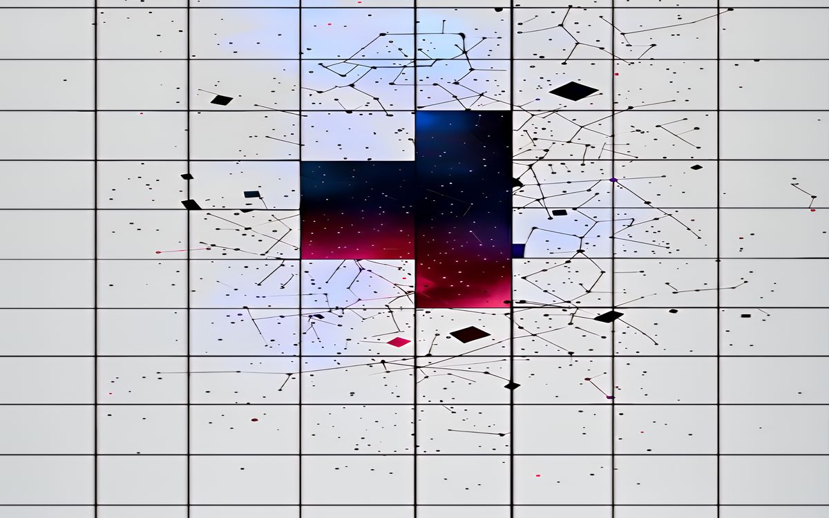
The typographic scale is the primary unifying element. Despite different grid and spacing configurations, all sections use the same font families, the same heading sizes, and the same body text treatment. This gives readers a stable reading experience even as the visual context shifts around them. The type scale follows a 1.333 ratio (perfect fourth): 16px body, 21px H3, 28px H2, 38px H1. It is a wider ratio than most layouts in this collection, chosen because the visual variety of the layout benefits from clearer heading distinctions.
Components in This Layout
Rather than a fixed component library, Unique uses a system of component primitives that combine differently in each section. The primitives are: text block, image block, metric block, list block, and quote block. In one section, text and image blocks might sit side by side in a two-column arrangement. In the next, the same blocks might be stacked with the image spanning full width. The primitives are deliberately generic — their visual treatment comes from the section context rather than from the component itself.

Common Implementation Mistakes
- Changing the colour palette between sections. The shared palette is one of only two unifying elements (along with typography). If colours also change, the page stops feeling like a single document and becomes a random sequence of unrelated blocks.
- Introducing more than 5-6 distinct section layouts on a single page. Beyond that threshold, the variety becomes exhausting rather than interesting. The viewer has no time to appreciate each composition before the next one demands attention.
- Using different typographic scales in different sections. The type scale is the reader's anchor. If it changes, they lose the ability to quickly assess content hierarchy, and the page becomes genuinely confusing rather than pleasantly surprising.
- Designing sections in isolation without checking the full page scroll. Adjacent sections may individually look great but create jarring transitions if their visual weights are mismatched. Always review the full sequence.
- Attempting Unique without strong visual design skills. This layout requires genuine compositional ability in every section. A layout that changes but is not consistently well-designed will look worse than a simple template used consistently.