
Vaaka
Vaaka is a balanced horizontal layout with measured proportions, inspired by Finnish minimalist design principles. The name means 'scale' or 'balance' in Finnish, and that is exactly what this layout pursues — every element is weighed against its neighbours, with no single component dominating the visual field. The result is a calm, confident composition that communicates competence through restraint.
We developed Vaaka after working with several Nordic design teams who consistently prioritised visual equilibrium over dramatic focal points. Their approach was educational: instead of creating hierarchy through size and contrast (the default Western pattern), they achieved it through placement and whitespace. Vaaka translates that philosophy into a web layout where the most important content is identified not by being the largest element, but by occupying the most balanced position on the page.
Design studios, architecture firms, consulting agencies, and any site that needs to communicate professionalism without loudness will find Vaaka's restraint appropriate. It is also valuable for theme authors studying how minimalism works structurally — the layout achieves its character through proportion rather than decoration, making it an excellent case study in doing more with less.
Layout Anatomy
Vaaka uses a symmetric two-column grid with equal widths and a generous 48px gutter. The symmetry is the layout's defining structural choice — where most two-column layouts create a primary/secondary hierarchy through column width, Vaaka gives both columns equal weight and lets content placement create the hierarchy. On medium viewports, the columns remain side by side but compress to narrower widths rather than stacking. Stacking occurs only on mobile (below 600px), preserving the horizontal balance as long as the viewport allows it.
Spacing and Typography Notes
Whitespace in Vaaka is more generous than in any other layout in this collection. The minimum spacing between elements is 32px (4× the standard unit), and section spacing reaches 96px (12× the standard unit). This amount of whitespace would feel wasteful in a content-dense layout, but in Vaaka's minimalist context it functions as a compositional element — the space around an element is as intentional as the element itself. The spacing is also what creates the perceived 'balance' that defines the layout.
Typography uses a single font family — the system sans-serif stack — at two weights: 300 (light) for headings and 400 (regular) for body text. This is counterintuitive — most layouts use heavier headings — but the light heading weight is part of the minimalist approach. Hierarchy comes from size and placement rather than weight contrast. The base font size is 16px with a line height of 1.7, which is on the generous side and matches the overall spaciousness of the layout.
Components in This Layout
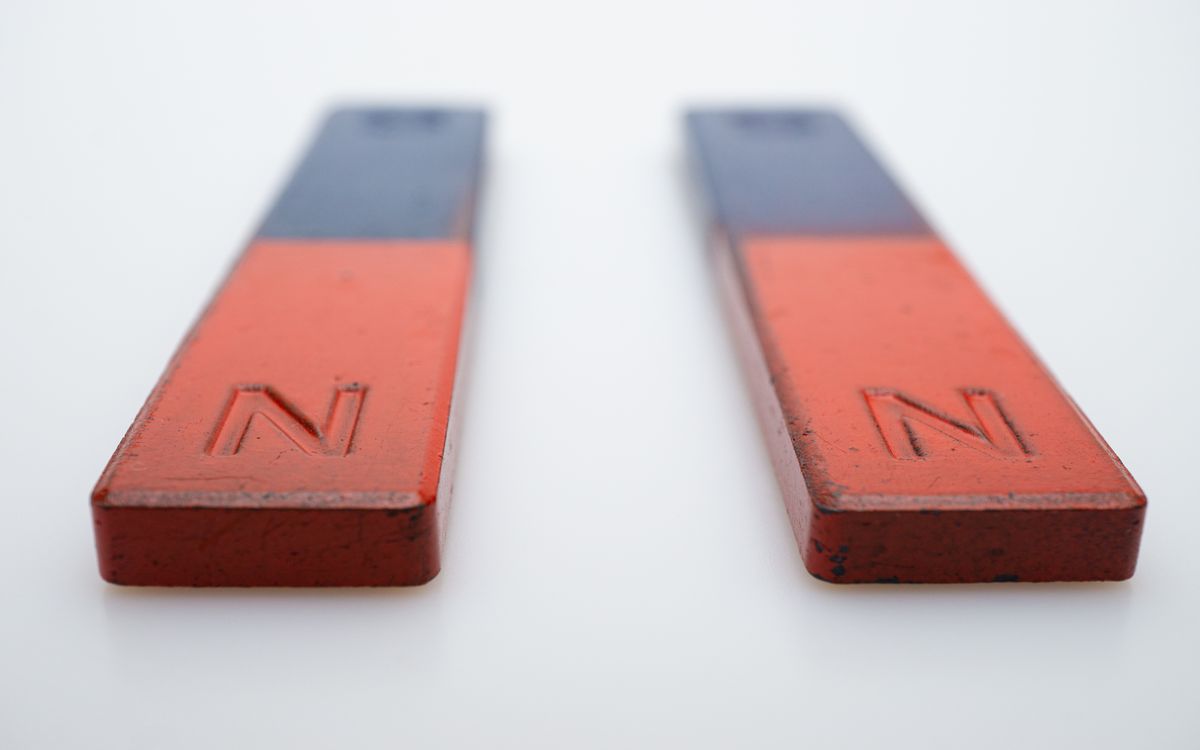
Components in Vaaka are deliberately few: the balanced image block (two images side by side at identical dimensions), the centered text block (a short passage centered in the viewport), the stat pair (two metrics displayed symmetrically), and the horizontal rule with a centered label. Every component maintains the bilateral symmetry that defines the layout. Asymmetric components — pull quotes, sidebar callouts, off-center images — are intentionally excluded because they would break the layout's fundamental premise.

Common Implementation Mistakes
- Adding an asymmetric element because it 'breaks the monotony.' Vaaka's calm comes from its symmetry. One off-center element undermines the entire composition. If you want visual variety, adjust the spacing or introduce a different content type — do not break the balance.
- Reducing the whitespace to fit more content. The generous spacing is structural, not decorative. Compressing it turns Vaaka into a generic two-column layout and eliminates the quality that makes it distinctive.
- Using bold or heavy font weights. The light heading weight is a deliberate choice that contributes to the minimalist feel. Switching to 700 or 800 weight introduces visual heaviness that conflicts with the layout's restraint.
- Placing more than 4-5 content sections on a single page. Vaaka's generous spacing means each section takes significant vertical space. Beyond 5 sections, the page becomes excessively long and the scrolling experience undermines the balanced composition visible at any given scroll position.
- Forcing the columns to stack too early. The symmetric two-column layout is the core experience. Stacking at 768px sacrifices the layout's identity for a full third of your visitors. Push the stack point to 600px and let the columns compress at medium widths.